A price chart can look like noise until someone shows you the handful of things it is actually saying. Every chart, no matter how busy, is built from the same simple parts: an axis for price, an axis for time, and marks that show what the price did. Learn to read those, and the intimidating wall of candles turns into a clear story of what a market has been doing. Here is how to read a crypto price chart from scratch.
The two axes
Every price chart is a grid with two axes. The vertical axis on the side shows price: higher up means a higher price, lower down means a lower one. The horizontal axis along the bottom shows time, moving from the past on the left to the present on the right. Any point on the chart therefore answers one question, what was the price at this moment in time. Once you internalize that, everything else is detail.
Line charts versus candlesticks
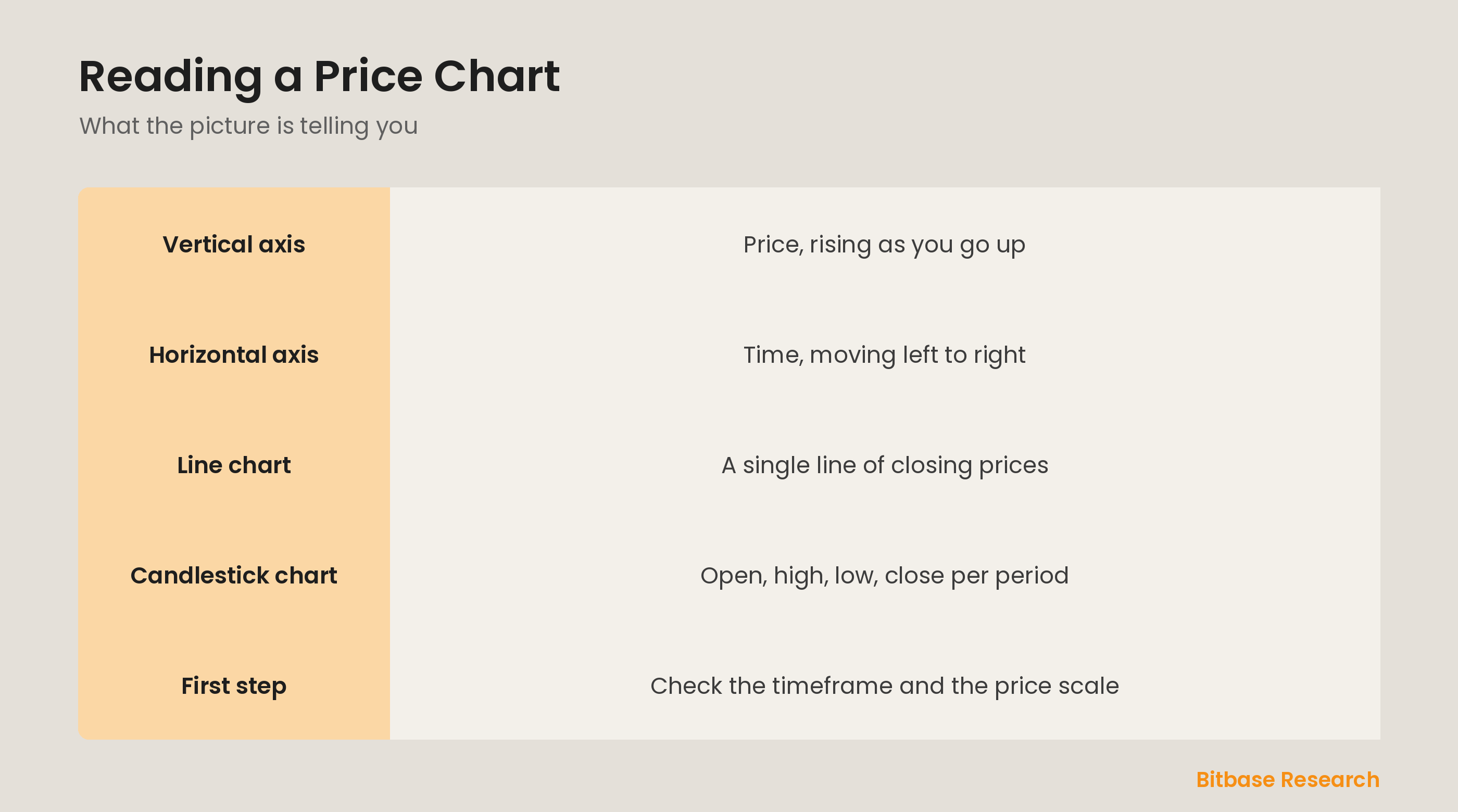
The simplest view is a line chart, which just connects the closing price of each period into a single line, giving you the overall shape of the move without clutter. A candlestick chart shows much more: for each period it draws the open, high, low, and close as a little bar with a body and wicks. Line charts are great for seeing the big trend at a glance; candlesticks are for reading the detail of how price moved within each period.
Reading price and time together
To read any point, combine the two axes. Find where a candle or line sits vertically to read its price, and where it sits horizontally to read its time. A candle that is high on the chart and on the right is a recent high price; one that is low and on the left is an older low. Reading a chart is just doing this quickly across the whole picture, letting your eye follow the price up and down as time moves right.
Getting oriented before you analyze
Before drawing any conclusions, check two settings. First, the timeframe, whether each candle is a minute, an hour, or a day, because it completely changes what the chart means. Second, the price scale, since a chart zoomed into a tiny range can make a small move look dramatic. Orienting yourself to the timeframe and scale first keeps you from misreading a calm market as wild, or a huge move as trivial.
The bottom line
A price chart is built from two axes, price going up the side and time going left to right, so every point tells you what the price was at a given moment. A line chart traces closing prices for the big picture, while a candlestick chart shows the open, high, low, and close of each period for detail. Read price and time together, and always check the timeframe and scale first so you interpret the picture correctly. To keep learning the fundamentals, follow more from Bitbase Academy.
Disclaimer: This article is educational content from Bitbase Academy, provided for information only. It does not constitute investment, trading, tax, or financial advice. Crypto assets are volatile; assess your own risk. Written as of June 2026; refer to the latest official information.
References
[1] Investopedia, "OHLC Chart: Definition, Uses, How to Read" investopedia.com
[2] Investopedia, "Candlestick: What It Is, What It Tells Investors" investopedia.com
[3] Investopedia, "Technical Analysis: What It Is and How to Use It" investopedia.com